Most students ask whether they are allowed a diagram. The better question is whether they can afford one. A figure that is properly introduced, read and sourced costs around 90 words of a 1,500-word essay — roughly six per cent of everything you have. Perhaps one figure in five is worth that. Here is how to tell which one you have.
First, the rules question — honestly answered
We could not find a stated policy on figures, tables or images on the HIEEC pages we reviewed, and the full rules for the coming cycle had not been posted at the time of writing. That means nobody can tell you with authority whether an image is permitted, whether captions count toward the word limit, or what file format the organisers want. Anyone who states those things flatly is guessing from an earlier cycle or from a different competition. Check thehuea.org when the cycle's rules appear, and if a question matters to your draft, ask the organisers directly.
Until then, work from two safe defaults. First, assume every visible word counts — captions, axis labels written as text, table cells. If the rule turns out to be more generous, you have lost nothing. If you assumed the opposite and were wrong, you are over length on a contest built around a strict limit. Second, write prose-first. Draft the essay so it works with no figures at all, then ask whether adding one improves it. An essay that depends on an image is fragile if formatting rules turn out to be restrictive.
What a figure can do that a sentence cannot
There are exactly three jobs where a visual genuinely beats prose, and recognising them prevents most bad decisions.
- Shape over time. A series that rises, then turns, then flattens. Describing a non-monotonic path in words takes three clumsy sentences and the reader still cannot see it. A line does it instantly.
- Spread across many units. Twelve countries, twenty sectors, thirty years. Prose can carry three comparisons; beyond that it becomes a list, and lists are the least readable thing in an essay.
- Structure or flow. Who pays whom, in what order, through which intermediary. A payment chain or an incidence path is genuinely spatial, and drawing it is honest rather than decorative.
And three jobs a figure cannot do, however good it looks. It cannot establish causation — two lines moving together is the oldest trap in student economics, and our guide to writing the 1,500-word essay treats the mechanism as the thing that carries the argument. It cannot substitute for a mechanism: a reader who cannot see why the relationship exists is not persuaded by seeing that it does. And it cannot manufacture originality. A well-drawn chart of a widely known series signals competence, not insight.
The IB and AP diagram habit, and the test that settles it
If you have studied economics at school you have spent two years being rewarded for drawing supply and demand, labelling the axes, shifting a curve and shading a welfare triangle. That habit will hurt you here, and it is worth understanding precisely why.
In an examination, the diagram is the answer — it demonstrates that you can operate the model. In an essay competition read by economics students and a professor, the model is assumed. Redrawing a standard diagram tells your reader something they already know and spends words proving you attended class. The marginal information is close to zero, and the space cost is real.
| Figure you are considering | Usual verdict | Why |
|---|---|---|
| Standard supply-and-demand shift | Cut | The reader can draw it themselves; it re-states a model rather than applying one |
| Welfare triangles for a tax or tariff | Cut, unless the size comparison is your argument | Only earns space if you are claiming one area exceeds another and can defend the magnitudes |
| Your own chart from public data | Often keep | Shows a shape you are actually arguing about; self-made, so citation is clean |
| Comparison table across countries or years | Keep if four or more rows | Beyond three comparisons prose degrades into a list |
| Flow or incidence diagram you drew | Keep if the flow is contested | Structure is genuinely spatial; drawing it is an argument, not decoration |
| Chart copied from a report or news article | Avoid | Permission and attribution problems, and it is someone else's analytical choice, not yours |
There is one honourable exception to the “cut the textbook diagram” rule. If your argument turns on a comparison of elasticities — one curve steeper than the other, and the whole conclusion depends on which — then the diagram is doing real work, because it is showing the specific configuration you are claiming, not the general model.
Rather than argue case by case, run every candidate figure through the same three questions, in order. The test is deliberately hard to pass, because in a 1,500-word format the default answer should be no and the burden of proof belongs to the image.
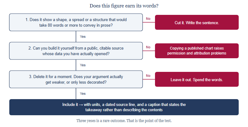
Question three is the one people skip, and it is the decisive one. A figure that looks good but changes nothing if deleted is decoration — and in a 1,500-word format, decoration is the most expensive thing you can buy.
Counting the real cost
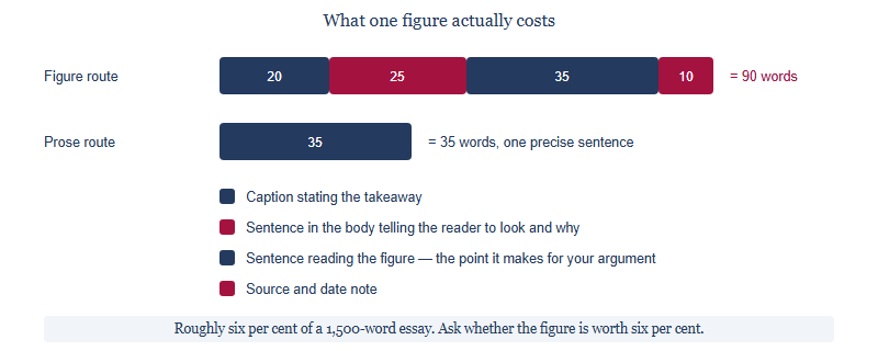
An unread figure is worse than no figure. If you drop an image into the essay and never point at it, the reader either ignores it — wasting the space — or interprets it themselves and reaches a conclusion you did not intend. Both are losses. The rule is simple: if you are not willing to spend the sentences reading it, do not include it.
If you keep one: six checks, and the default answer
- Units and period on the figure itself. “Per cent of GDP, 2010–2024” on the axis, not buried in your text.
- A named, dated source line. The database and the access date, matching the citation style you have used elsewhere — see our guidance on choosing and committing to a prompt for why consistency across the whole document matters more than which convention you pick.
- Built by you from public data. Self-made charts avoid permission questions entirely and let you choose the framing your argument needs.
- A caption that states the takeaway. “The gap widens only after 2018” beats “Figure 1: trade balance, 2010–2024.” The first is analysis; the second is a label.
- Referenced in the body. Named explicitly, at the point in the argument where it does its work.
- Honest axes. No truncated vertical scale that manufactures a dramatic slope, no mixing of nominal and real values on one chart. A reader who catches this stops trusting everything else you wrote.
That last point is worth dwelling on. Presentation choices are argumentative choices. Where you start an axis, which years you include, whether you index to a base year — each of these can make a modest pattern look decisive. Doing it deliberately is misconduct; doing it accidentally is still a lost reader. When in doubt, show the full series and let your prose carry the emphasis.
For most entrants, most of the time, the right number of figures is zero. This is not conservatism; it is arithmetic. The competition rewards a tight argument in a tight space, and the two commonest weaknesses in the drafts we edit are a thin mechanism and a missing objection — both of which are fixed by spending words, not pictures. Ninety words is most of an objection paragraph.
Override the default when your central claim is genuinely about a shape nobody can picture from a sentence, or a structure that is spatial by nature, and you built the visual yourself from data you can defend. In that case the figure is not an addition to the argument — it is part of the argument, and it will be the most memorable thing in the essay. If you are still orienting yourself in the contest, our complete guide to HIEEC covers the format and judging context these decisions sit inside.
Frequently asked questions
Are images allowed in a HIEEC essay?
The pages we reviewed do not state a figure policy, and the cycle's full rules were not posted at the time of writing. Confirm on thehuea.org.
Do captions count toward the word limit?
Not stated on the pages we reviewed. Assume they do; that assumption costs you nothing and protects you if the rule is strict.
Can I copy a chart from a report if I cite it?
Better not to. Citation is not permission, and a chart you built from the same public data is stronger and cleaner.
Is a table safer than a chart?
Often yes. Tables read as text, carry exact values, and survive any format conversion without distortion.
This is an independent guide operated by Hanlin Education for China-based international-school students. We are not affiliated with, endorsed by, or sponsored by the Harvard Undergraduate Economics Association, the Harvard College Economics Review, or Harvard University. Formatting rules, word limits, fees and deadlines are set by the organisers and change each cycle — confirm current details on thehuea.org. Factual corrections are made within 7 working days.